Shipwreck still sailing
The band covers an array of subject matter in their lyrical content. We wanted to leverage the lyrical aspects to further project what the material personifies.
“From the owner of a small business struggling to make money to a naval captain disgusted with genocide he’s being asked to perform in the name of discovering new lands, Trials is a collection of stories about different hardships. We have worked extremely hard to bring these songs and stories to life.”
With previous releases, they had this reoccurring character of a small child in their art. hanging around fictional beasts, almost symbolizing the band, like an avatar. So we wanted to utilize that character this in composition, representing the listener. Have them be a student struggling to succeed, or a small business owner dealing with everything that comes with running a business in this country. And everything in between. We wanted to have them face off something that would symbolize anyone’s fears in life. Why not take shape into a actual monster?
Ultimately I took the route of making the monster into something that came from what I was influenced from when i first started watching anime or reading mangas. A “Kaiju”, a Japanese version of a giant sea monster. Client initially wanted a Kraken but I pushed for something a little less obvious, less trite. Wanted ton show how perspective can be everything in story telling. From what perspective, behind the kid facing off the Kaiju, the monster can seem impossible to defeat. But from the Kaiju’s view we see something different. We see a scared, yet determined individual, wielding their harpoon with their hand out ready to stop what’s coming. Its all about perspective.

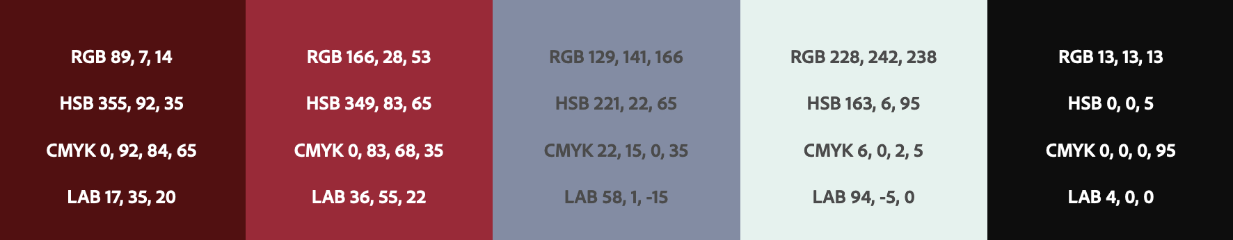
We crafted a color scheme that speaks volumes about our brand. We decided to go with a harmonious combination of cool and warm tones to evoke a sense of balance and sophistication. Our primary colors are a rich navy blue that symbolizes trust and reliability, and a vibrant gold that represents luxury and success. These colors are complemented by a refined blend of neutral grays and whites, adding a touch of elegance and modernity to our visual identity. This thoughtfully chosen color scheme not only captures the essence of the brand but also creates a visually captivating experience for our audience.